
Planning Your Furniture Layout With an AI Room Designer
A good redesign lives or dies on the floor plan, not the paint color — where the sofa faces, how you actually walk through the room, whether the rug is the right size underneath it all. An AI room designer lets you drag, swap and re-orient furniture in a photo of your real room, so you can test a layout before lifting anything heavy. Get the walkway, seating and rug measurements right first, and the rest of the redesign — color, texture, accessories — has something solid to sit on.
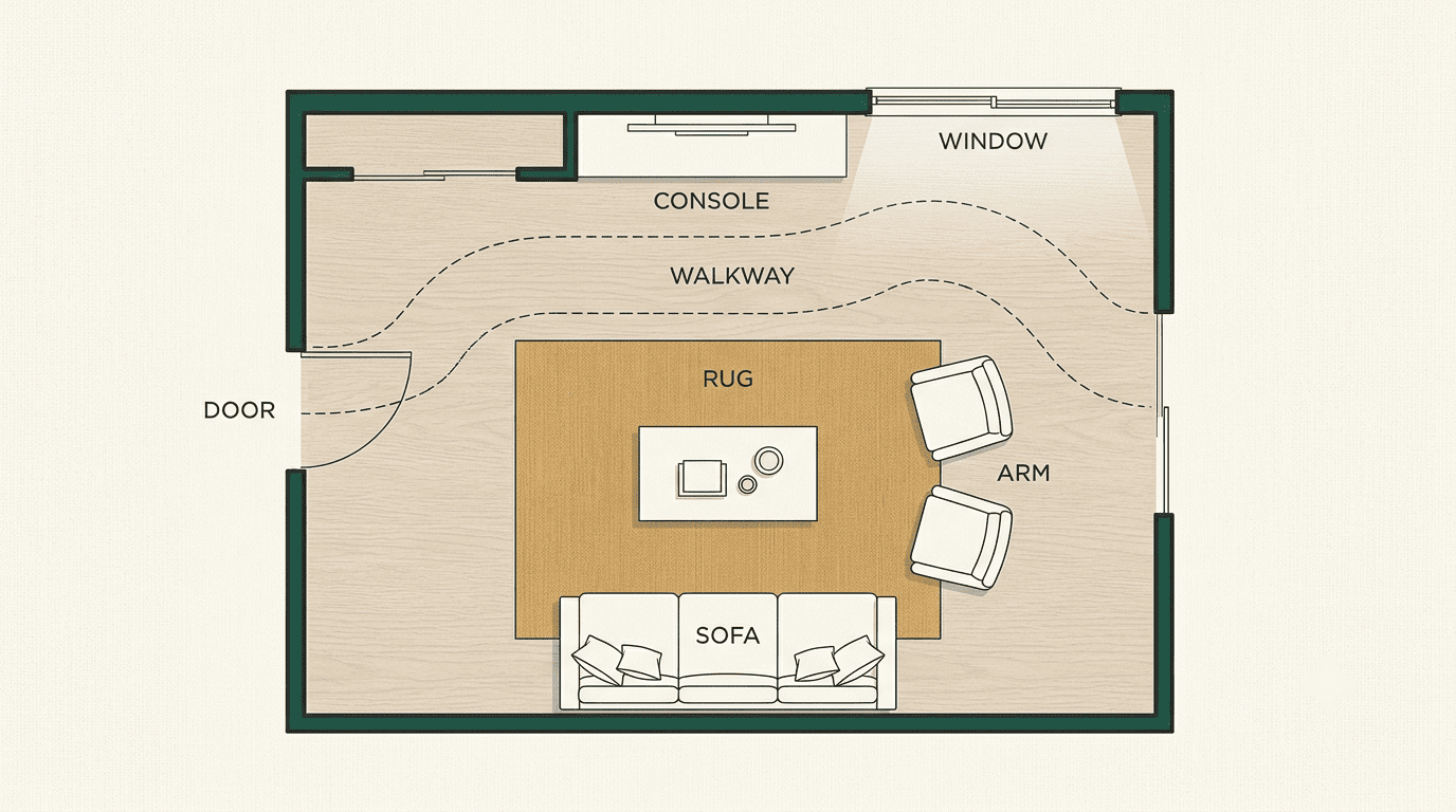
This guide covers the measurements that make a room work — walkways, seating clearances, rug sizing — plus focal points, zoning open-plan spaces, arranging around windows and doors, the mistakes to avoid, and how to pressure-test all of it with AI room design before you move a single piece.
Start With the Floor Plan, Not the Furniture
A furniture layout is really three decisions made in order: pick the room’s focal point, build a seating group that faces it, then keep the paths through the room clear. Skip that order and you end up shuffling a sofa around for an afternoon with no better result than when you started.
Before any of that, measure the room itself. Record the length and width, ceiling height, where windows and doors swing open, and the fixed features you can’t move — a fireplace, radiators or vents, and outlet and switch positions. These constraints define the box your layout has to fit inside, and a rough to-scale sketch on paper (or graph paper, if you want to be precise) turns a vague idea into something you can actually plan against.
This is also where an AI room designer or AI room design tool earns its keep: feed it the same room photo and it can generate a top-down plan alongside a photorealistic render, so you’re comparing the same layout two different ways before committing to either.
Measure the room and mark the fixed constraints
Walk the room with a tape measure and note the following before you plan anything:
- Overall dimensions — length x width, plus ceiling height if you’re hanging anything.
- Window and door swings — how far a door opens into the room, and where window sills sit.
- Fixed features — fireplace, built-ins, radiators or HVAC vents that furniture can’t block.
- Outlets and switches — so lamps and electronics land near a working outlet, not three feet short of the cord.
None of these move once you start arranging furniture, so treat the list as the boundary of the puzzle rather than a detail to revisit later. A layout that ignores a door swing or a radiator on paper runs into the same wall in real life.
Traffic Flow and Clearances — the Numbers That Make a Room Work
This is the section with the real, cited numbers. Interior designers generally agree on a fairly narrow band of clearances that keep a room comfortable to move through, and they’re worth writing down rather than eyeballing.
| Clearance | Minimum | Comfortable |
|---|---|---|
| Main walkway | 36 in | 42 in |
| Secondary path (between furniture) | 30 in | — |
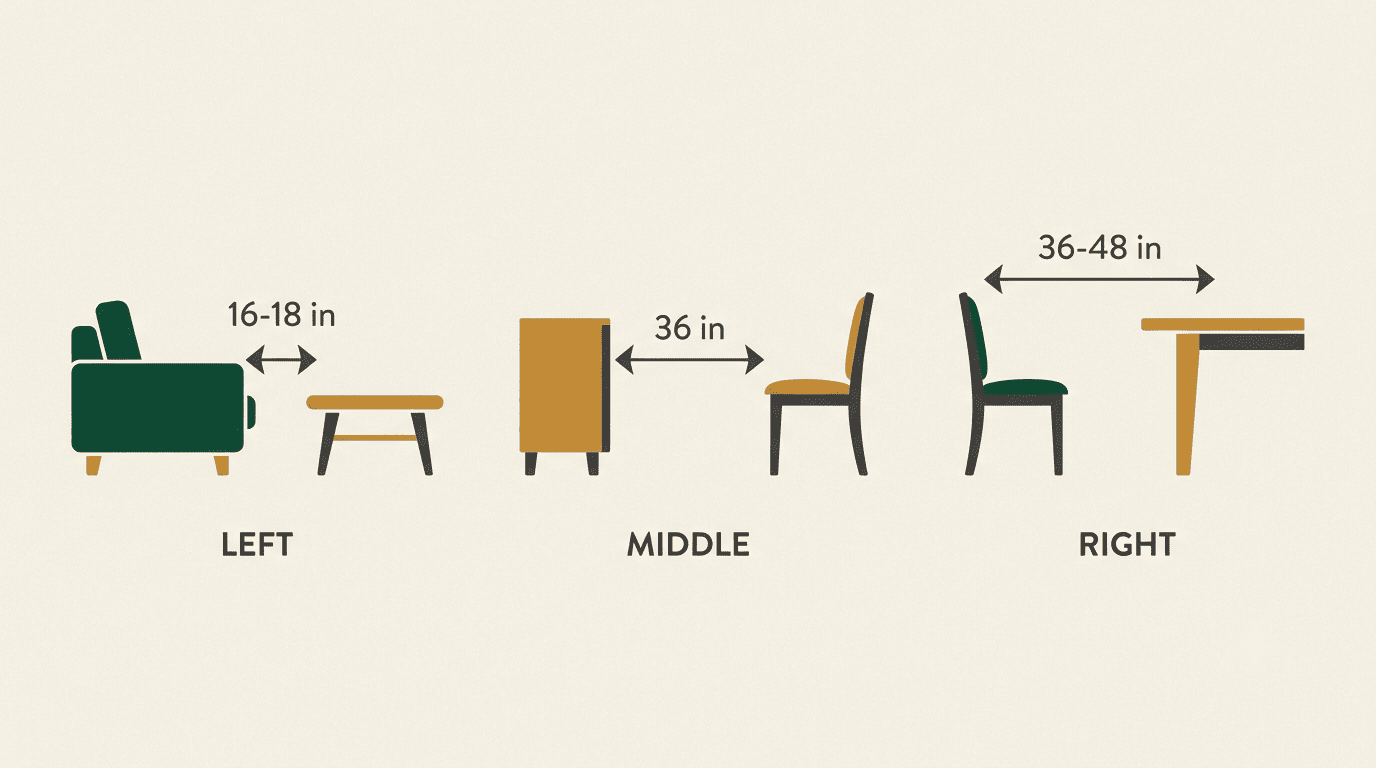
| Sofa to coffee table | 12 in (14 in typical) | 16–18 in |
| Dining chair pull-out | 36 in | 42–48 in |
| Living-to-dining transition | 42 in | 48 in |
Anything under 24 inches reads as obstructed no matter how the rest of the room is arranged.
Walkways and paths
Main routes through a room — from the entry to the seating area, and on to any other exits — should measure at least 36 inches wide, with 42 inches feeling genuinely effortless to walk. Secondary paths between individual pieces of furniture can drop to 30 inches minimum. Once a gap falls under 24 inches, most people start turning sideways to get through, which is the clearest sign a layout needs adjusting.
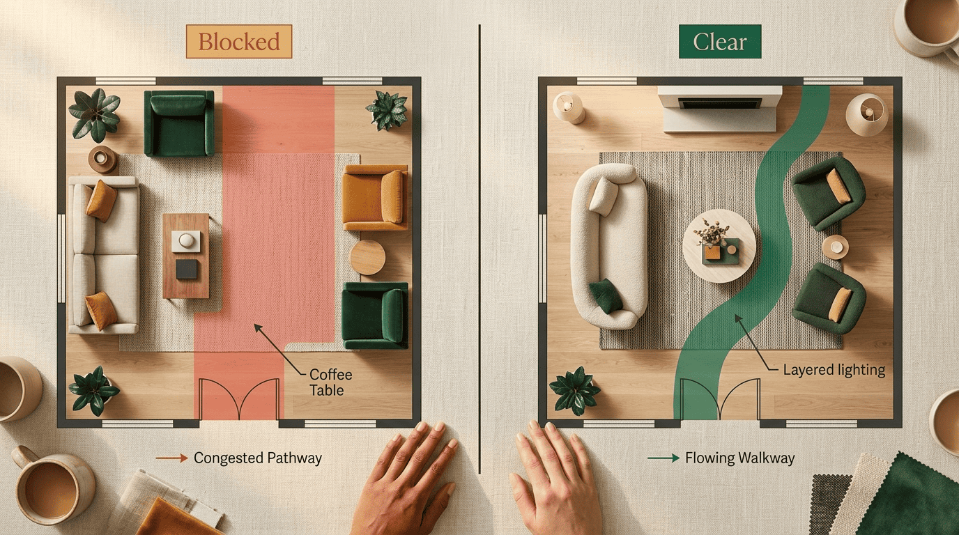
Keep the route from the door to the seating group unbroken — no side table or ottoman parked directly in the way. The same logic applies to any secondary exit, like a door to a patio or hallway: it needs its own clear line, not just the main entry.
Seating group clearances
The distance between the sofa and the coffee table matters more than most people think: 14 to 18 inches is the working range, with 16 to 18 inches the sweet spot, and it should never drop below 12 inches. Measure from the front of the seat cushion, not the frame. Livingetc’s reporting on what it calls the «18-inch rule» traces this exact number back to professional design practice, and it’s become something close to an industry standard.
The coffee table itself should run roughly two-thirds the length of the sofa — a table that’s too long crowds the clearance zone, and one that’s too short looks lost in front of a larger piece. Side tables belong within arm’s reach at roughly armrest height, so a drink or a book doesn’t require standing up.
Dining and open-plan transitions
Dining chairs need room to slide back before someone can stand up: 36 inches minimum from the table edge to the nearest wall or furniture, and 42 to 48 inches if you want someone to be able to walk behind a seated guest without asking them to scoot in.
Where a living zone meets a dining zone in an open-plan room, leave 42 to 48 inches of transition space between the two. That gap does double duty — it’s wide enough to walk through comfortably and it reads as a visual break between the two areas, even without a wall to separate them.
Choose the Focal Point First
Every layout that actually works has an anchor, and most rooms already have one of three candidates:
- A fireplace — the traditional anchor, and usually the easiest to build a seating group around.
- A large window or view — worth orienting toward in rooms without a fireplace, especially with a scenic outlook.
- A media wall — the fallback when neither of the above exists, though it shouldn’t be the default by habit.
Emily Henderson’s team, writing about foundational living room design rules, makes the same point: pick one focal point and build around it, rather than letting the room drift toward whatever’s easiest.
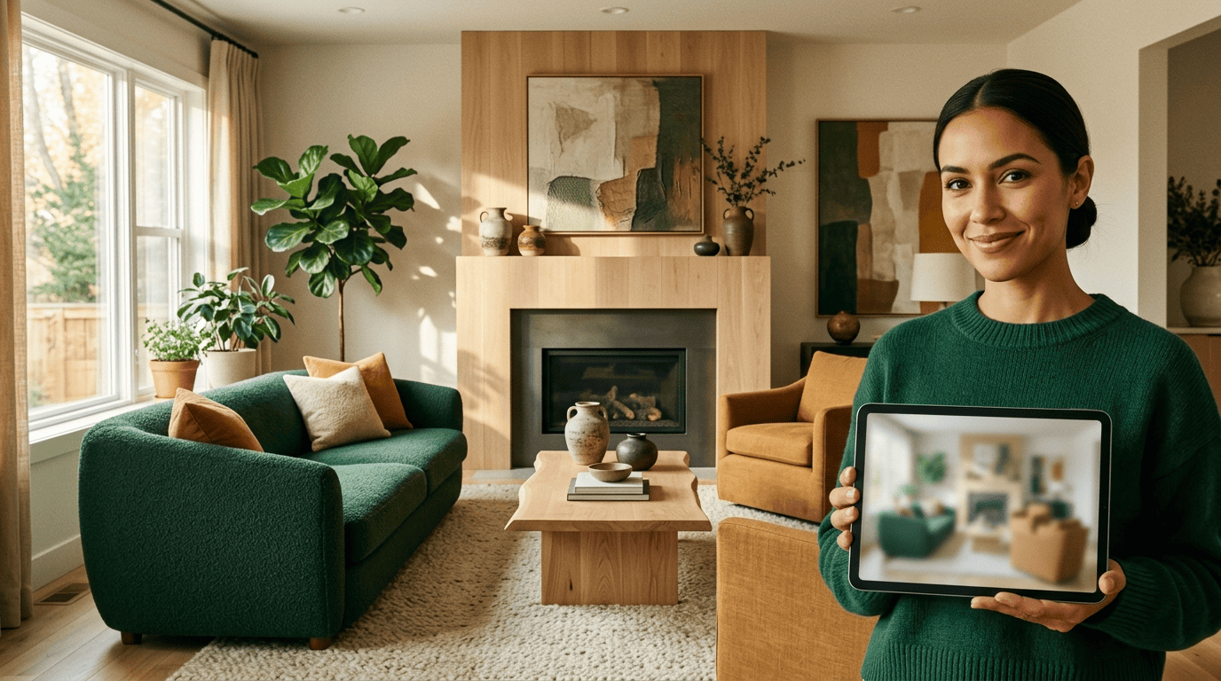
Watch the sports-bar trap. It’s tempting to point every chair at the television, but a room built entirely around a screen stops functioning as a place to actually talk. Balance the TV with a real focal point — even a bookshelf or a piece of art can anchor a seating group if there’s no fireplace or view to work with.
Use AI to test orientation before committing. An AI room designer makes it cheap to re-render the same room with the sofa turned toward different focal points — fireplace-facing versus window-facing versus TV-facing — so you can compare all three before deciding which one the room actually wants.
Zoning an Open-Plan Space
An open floor plan without walls still needs boundaries, just implied ones instead of built ones. The trick is carving one big room into living, dining and — if there’s room — a work zone, without adding a single partition.
Four tools do most of the work of zoning a room without walls:
- A dedicated rug per zone — the fastest visual cue that one area ends and another begins.
- A soft divider — the back of a sofa, a bookshelf, or a low console standing in for a wall.
- Layered lighting — a pendant over the dining table, floor lamps by the sofa, so each zone has its own mood under one ceiling.
- A protected walkway — 42 to 48 inches kept clear between the living area and the dining area.
Houzz’s rundown of common open-plan mistakes flags exactly this: rooms that skip zoning altogether tend to feel like one undivided blob rather than a home.
Sizing and Placing the Area Rug
The rug is the layout’s foundation, and it’s also the single most commonly botched piece of the whole plan. The rule that matters: the rug needs to be big enough that at least the front legs of the sofa and any accompanying chairs rest on it — having all four legs on the rug is even better, but front-legs-on is the non-negotiable minimum.
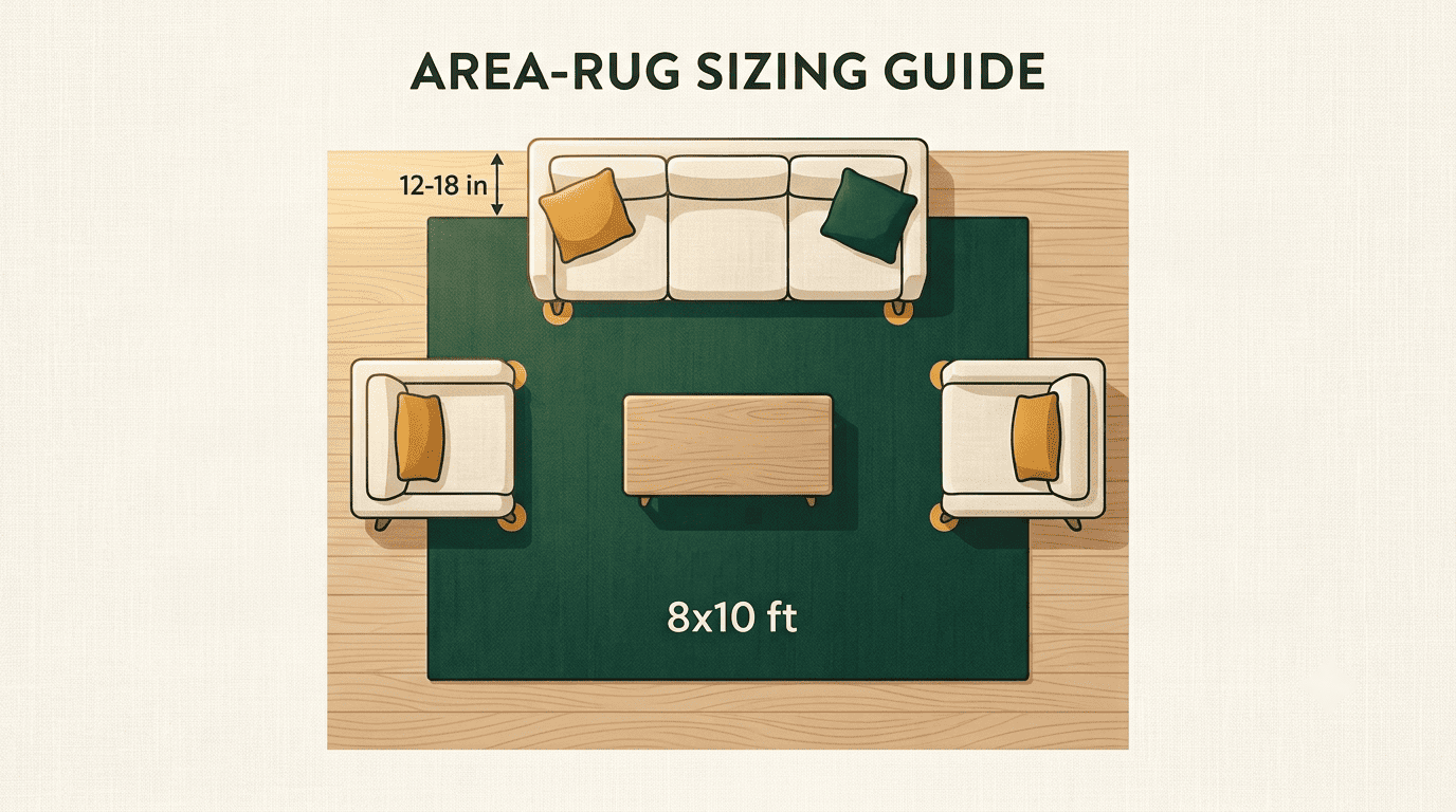
Leave 12 to 18 inches of bare floor between the rug’s edge and the walls in a smaller room, and 18 to 24 inches in a larger one — enough to frame the rug without it looking like an afterthought. According to Ruggable’s rug sizing guide, most living rooms land on either an 8×10 or a 9×12 foot rug, depending on the size of the seating group it needs to anchor.
| Room size | Common rug size | Bare floor to walls |
|---|---|---|
| Smaller living room | 8×10 ft | 12–18 in |
| Larger living room | 9×12 ft | 18–24 in |
A rug that’s too small and floats in the middle of the room, disconnected from the furniture around it, is the fastest way to make an otherwise well-planned layout look unfinished.
Arranging Around Windows and Doors
Windows and doors are fixed constraints, not decorating choices, so the layout has to work around them rather than the other way around.
Don’t block a door’s swing or the walkway leading through it. A door that can’t open fully, or one that dumps someone straight into the back of an armchair, breaks the room no matter how good everything else looks.
Keep low furniture under windows. A console, a bench, or a low-backed sofa preserves both the light coming in and the view out, where a tall bookcase would block both.
Floating a sofa in front of a window works — with a caveat. If the sofa’s back is a finished piece (not a raw frame meant to sit against a wall), it can float with its back to a window in an open-plan room, which also frees up wall space elsewhere for storage or art.
Radiators and heating vents need to stay unobstructed regardless of what else is happening in the room — furniture pushed up against a vent both wastes heat and, in some cases, is a fire hazard. An AI render is a low-stakes way to preview exactly how a sofa or console will read in front of a window before you commit to moving it there for real.
Common Furniture Layout Mistakes
Most bad layouts trace back to one of a handful of repeat offenders, and each one has a straightforward fix.
- Pushing everything against the walls. This is the single most common mistake, and it leaves the center of the room dead and the conversation area disconnected. Float the seating group inward toward the focal point instead — a few feet of breathing room behind the sofa reads as intentional, not wasted.
- A rug that’s too small and floating. Size up until at least the front legs of the seating land on it.
- Furniture blocking the natural walkway. Respect the 30 to 36 inch minimums covered above — an ottoman or side table parked mid-path undoes an otherwise solid plan.
- The whole room aimed at the TV. Balance it with a genuine focal point so the room still functions as a place to sit and talk.
- An open plan left as one undivided zone. Without rugs, lighting and soft dividers to break it up, a large open room reads as unfinished rather than spacious.
Homes & Gardens’ rundown of arranging mistakes covers several of these in more depth, and the common thread across all five is the same: furniture placed for convenience during move-in, never revisited once the room is actually lived in.
Designer Emily Henderson makes the wall-hugging mistake explicit in her own rulebook for living rooms:
If possible sofas should never be flush with a wall. Pull it out 3-5″ and give it some breathing room.
Emily Henderson
Test the Layout With an AI Room Designer Before You Move Anything
Once the numbers and the rules are in hand, the fastest way to apply them is to stop guessing and start testing:
- Snap a photo of the actual room — the real walls, windows and furniture, not a stock image.
- Generate several layout variations with an AI room designer, applying the rules above: front legs of the seating on the rug, sofa oriented toward the focal point, a clear 36-inch path from the entry.
- Compare the variations side by side rather than picking the first one that looks decent.
- Refine the strongest option — nudge the rug size, swap the focal point, tighten a walkway.
- Move the real furniture only once a version has solved the walkway, rug and focal-point questions on screen.
- Confirm exact measurements with a professional before any structural change or purchase.
This before/after comparison is where AI room design earns back the time spent measuring: dragging a real sofa across a room to test an idea takes an hour and risks scratched floors, while generating four render variations takes minutes and costs nothing to undo.
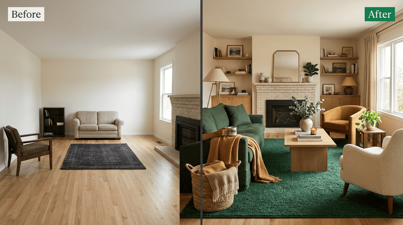
The same approach scales down for tighter footprints — the guide to redesigning a small space with AI walks through layout tricks when square footage is the binding constraint — and scales sideways for shared rooms, where the guide to fitting a desk into a home office covers zoning a workspace into a room that already has another job.
One caveat worth keeping in mind: AI renders are design ideas, not blueprints. Confirm exact measurements, materials, and any structural or renovation work with a professional or contractor before you build or buy anything based on what the render shows.