
Choosing a Color Palette With an AI Room Designer: A Simple, Foolproof Guide
Picking room colors is where most home projects stall — one wrong wall color and a whole room feels off. An AI room designer takes the guesswork out by suggesting balanced palettes and rendering them on a photo of your actual room in seconds.
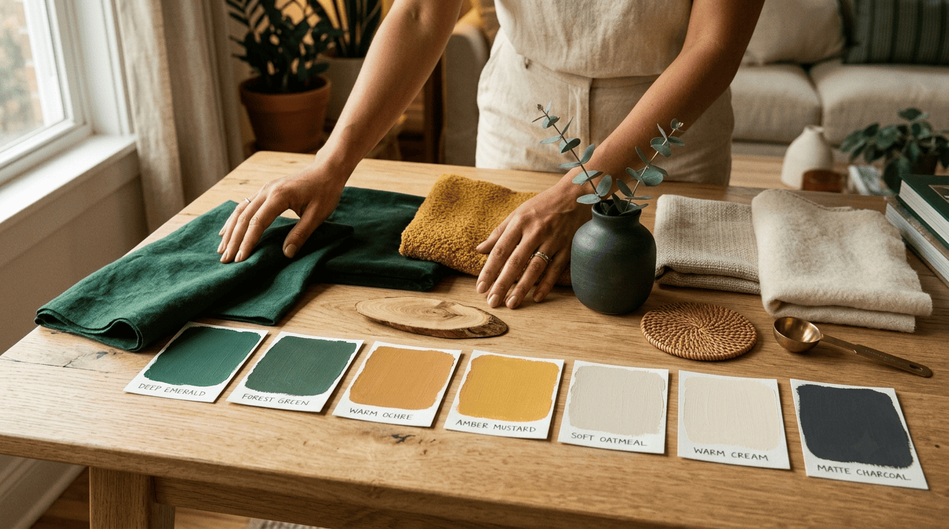
The trick is pairing a little color theory — the 60-30-10 rule, warm vs cool undertones, complementary and analogous schemes — with an AI that lets you test palettes instantly before you buy a single can of paint. This guide walks through both.
Color theory basics: how a palette actually works
A color palette isn’t a random handful of pretty shades — it’s a small system built on the color wheel, and knowing the basic vocabulary makes every later choice faster. Once you understand how hues relate to each other, picking a scheme stops feeling like guesswork.
The color wheel, complementary and analogous schemes
The color wheel organizes hues so you can see how they relate to one another. A complementary scheme uses colors opposite each other on the wheel — warm orange paired with cool blue, for example — for a dynamic, high-contrast look. An analogous scheme uses neighbors on the wheel, such as blues and greens, which share undertones and blend without harsh contrast. A monochromatic scheme takes it further still, using a single hue in several shades and tints for a quiet, unified room.
Warm vs cool — and why undertones decide everything
Warm colors — reds, oranges, yellows — grab attention and make a space feel intimate; cool colors — blues, greens, purples — read as open, balanced and relaxing, according to Benjamin Moore’s guide to warm and cool paint colors. Crucially, every color has its own warm or cool undertone: a cool blue leans slightly greenish, while a warm blue leans slightly reddish. Matching undertones — not just matching hues — is what makes a palette feel intentional rather than accidental.
As the painter and color theorist Josef Albers put it:
In visual perception a color is almost never seen as it really is — as it physically is. This fact makes color the most relative medium in art.
Josef Albers, Interaction of Color
That relativity is exactly why undertones trip people up: the same «blue» can read cold on one wall and warm on another depending on the light and the colors around it. A quick note before you commit to anything: on-screen color and real paint never match perfectly, so always confirm a shade with a physical swatch in your own room before buying a gallon.
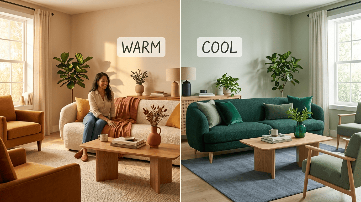
A fast way to sort any color you’re considering:
- Warm signal: leans red, orange or yellow
- Cool signal: leans blue, green or purple
- Warm mood: cozy, energizing, intimate
- Cool mood: calm, open, relaxed
The 60-30-10 rule: the backbone of a balanced palette
Most professionally balanced rooms — whether a designer planned them or an AI room designer suggested them — quietly follow the same ratio.
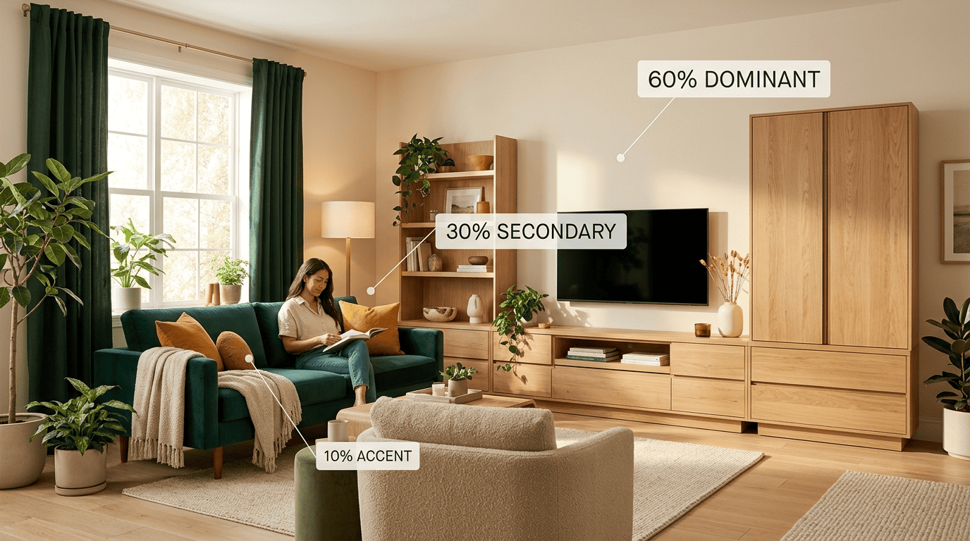
60% dominant, 30% secondary, 10% accent
Cover roughly 60% of the room in a dominant color: usually the walls, large furniture and rug, the visual backdrop of the space. Use about 30% for a secondary color that adds depth — accent chairs, curtains or a feature wall. Reserve the remaining 10% for an accent color that pops on cushions, lamps, art and small decor. Want a fourth color in the mix? Split the 30% into two 15% shares instead.
| Share | Where it typically shows up | Role in the room |
|---|---|---|
| 60% dominant | Walls, large furniture, rug | The backdrop |
| 30% secondary | Accent chairs, curtains, feature wall | Adds depth |
| 10% accent | Cushions, lamps, art, small decor | The pop |
The 60-30-10 rule is one of the most repeated tools in interior design precisely because it’s simple enough to apply on a first attempt and forgiving enough to survive small mistakes.
When to break the rule
The 60-30-10 split is a starting framework, not a law — experienced designers deliberately bend it for bolder, more minimal or more maximalist rooms. Its real value is preventing the two classic beginner mistakes: a flat, single-color room that feels unfinished, or a chaotic six-color one that feels noisy. Once you understand why the ratio works, breaking it on purpose is a design choice instead of an accident.
Picking wall, decor and accent colors that work together
Start from one anchor object. The easiest way into a palette is to pick one piece you already love — a rug, a large artwork, a patterned fabric — and pull your dominant, secondary and accent colors straight out of it. This guarantees the palette relates to something real already sitting in your room instead of an abstract paint chip picked in isolation.
Let neutrals carry the load. Using a neutral — warm oatmeal, greige, soft charcoal, natural oak tones — as your 60% dominant is the safest way to make a saturated accent, like emerald, ochre or terracotta, feel special rather than overwhelming. A neutral base gives the eye somewhere to rest, so the smaller pops of color actually register as intentional highlights.
Watch how colors sit next to each other, not just alone. A paint chip that looks perfect on its own can shift completely once it’s beside your sofa fabric or wood floor — this is where testing on an actual photo of the room, rather than swatches on a table, prevents the most common repainting regrets.
Keep a running shortlist. Most people land on a workable palette faster by narrowing three or four candidate combinations first, rather than agonizing over a single «correct» answer from the start.
- Anchor object (rug, art, fabric)
- Dominant neutral (60%)
- Secondary color (30%)
- Accent color (10%)
Matching your palette to a style and to your room
Color and style are closely linked, so choosing a design direction first narrows your palette almost automatically. A Scandinavian or Japandi look leans on light, muted, mostly-neutral palettes with soft cool undertones, while midcentury modern pairs warm woods with a few saturated accent colors like mustard or burnt orange. If you’re starting with your main living space, our AI living room design guide is a natural place to try these palettes before you settle on a scheme.
A few common style-to-palette pairings to start from:
- Scandinavian: white, soft gray, pale wood, one muted accent
- Japandi: warm neutral, natural oak, muted clay or moss
- Midcentury modern: warm wood tones, mustard, burnt orange, olive
- Coastal: soft blue, sandy neutral, crisp white
Room orientation and size matter just as much as style. In the Northern Hemisphere, north-facing rooms receive cooler, flatter daylight, so warmer paint colors help balance them out; south-facing rooms already flood with warm light and can handle cooler tones without feeling cold. (South of the equator this reverses — north-facing rooms get the warm sun and south-facing ones the cooler light — so judge by which way the light actually falls in your room.) Pale, light palettes make a small space or studio feel bigger and airier, while deep, saturated colors make a large or sparsely furnished room feel cozier and more intimate.
| Room condition | Palette that tends to work |
|---|---|
| North-facing / cool light | Warmer dominant color to balance the light |
| South-facing / warm light | Cooler tones read as fresh, not cold |
| Small space or studio | Pale, light dominant color to expand the space |
| Large or sparse room | Deeper, saturated tones for coziness |
Testing palettes on your real room photo with AI
Hiring a professional designer for a full room redesign typically means consultations, mood boards and revisions stretched over several weeks before you see an actual rendered result. An AI room designer collapses that timeline: instead of imagining a color on your wall, you upload a photo of the room, pick a palette or style, and the AI renders the space repainted in seconds — usually generating several variations so you can compare them side by side.
Upload, apply, compare
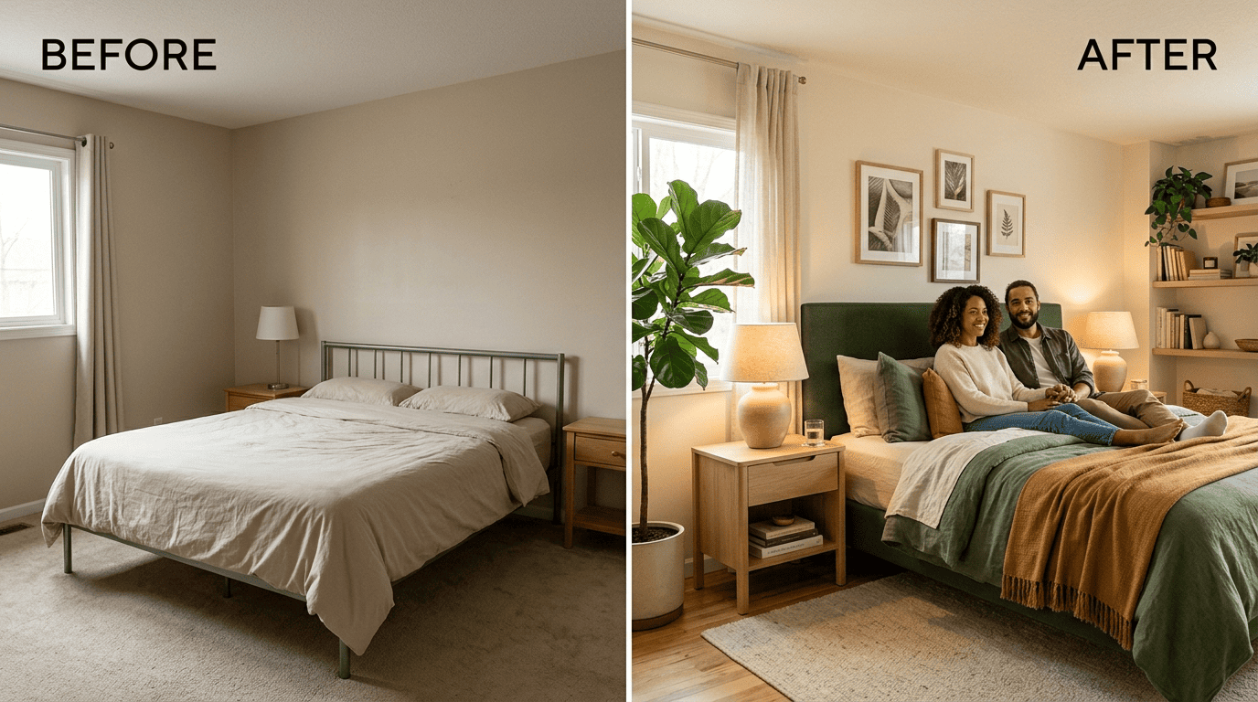
This photo-first workflow is the same one behind a focused bedroom color refresh: you see how a color actually reads in your own light and against your existing furniture, rather than guessing from a one-inch paint chip. Photo-based AI tools have caught on precisely because testing a palette this way is faster and cheaper than committing to paint and finding out you don’t love it.
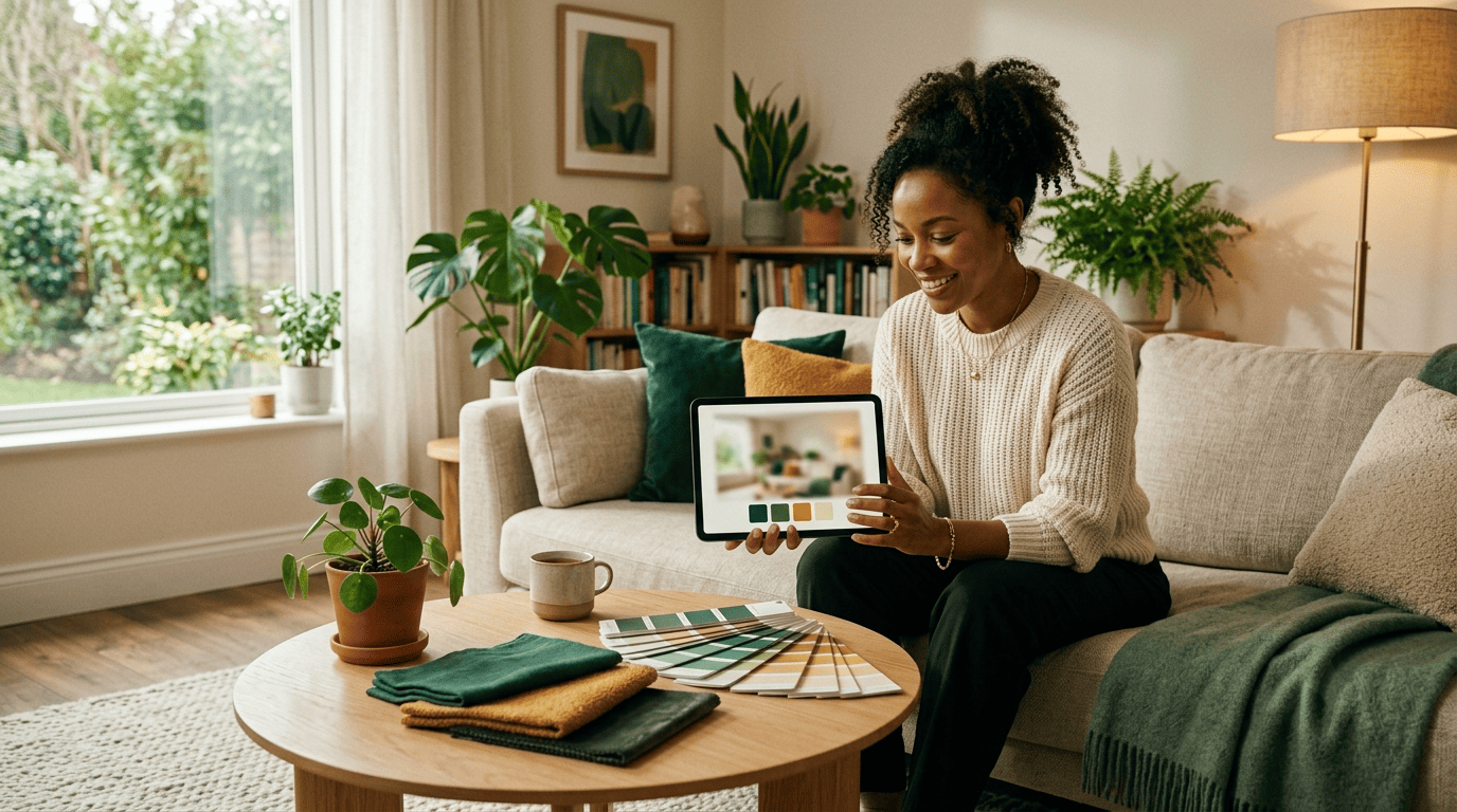
A simple workflow to test a palette before you buy paint:
- Take a clear, well-lit photo of the room you want to repaint.
- Upload it to an AI room designer.
- Choose a style (Scandinavian, midcentury, Japandi, and so on) or a specific palette.
- Generate two or three variations to compare side by side.
- Shortlist the palette that best matches your light, room size and existing furniture.
- Order physical paint swatches for your top pick and view them in your room at different times of day.
- Bring your favorite render and swatch to a paint store or contractor before buying in bulk.
Build a moodboard, then confirm in real life
Save the palettes you like into a moodboard that collects wall, decor and accent swatches in one place, so you can compare options at a glance instead of scrolling back through renders. A useful moodboard usually holds:
- The dominant wall/paint color
- The secondary fabric or furniture color
- The accent color for decor
- A texture or material reference (wood, metal, woven fiber)
AI renders are design ideas, not final specs: always confirm the exact colors on physical paint swatches in your own room before buying, and confirm materials, budgets, and any structural or renovation work with a professional or contractor before committing to the project. As one hands-on review of AI interior design tools found, these apps are best treated as a fast way to narrow ideas — not a replacement for seeing the real materials in person.